單一值
就是基本的圓角 四邊的值都一樣
border-radius: 30%;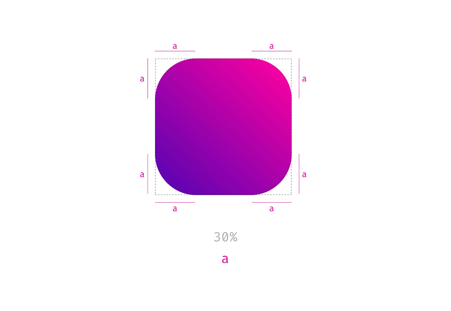
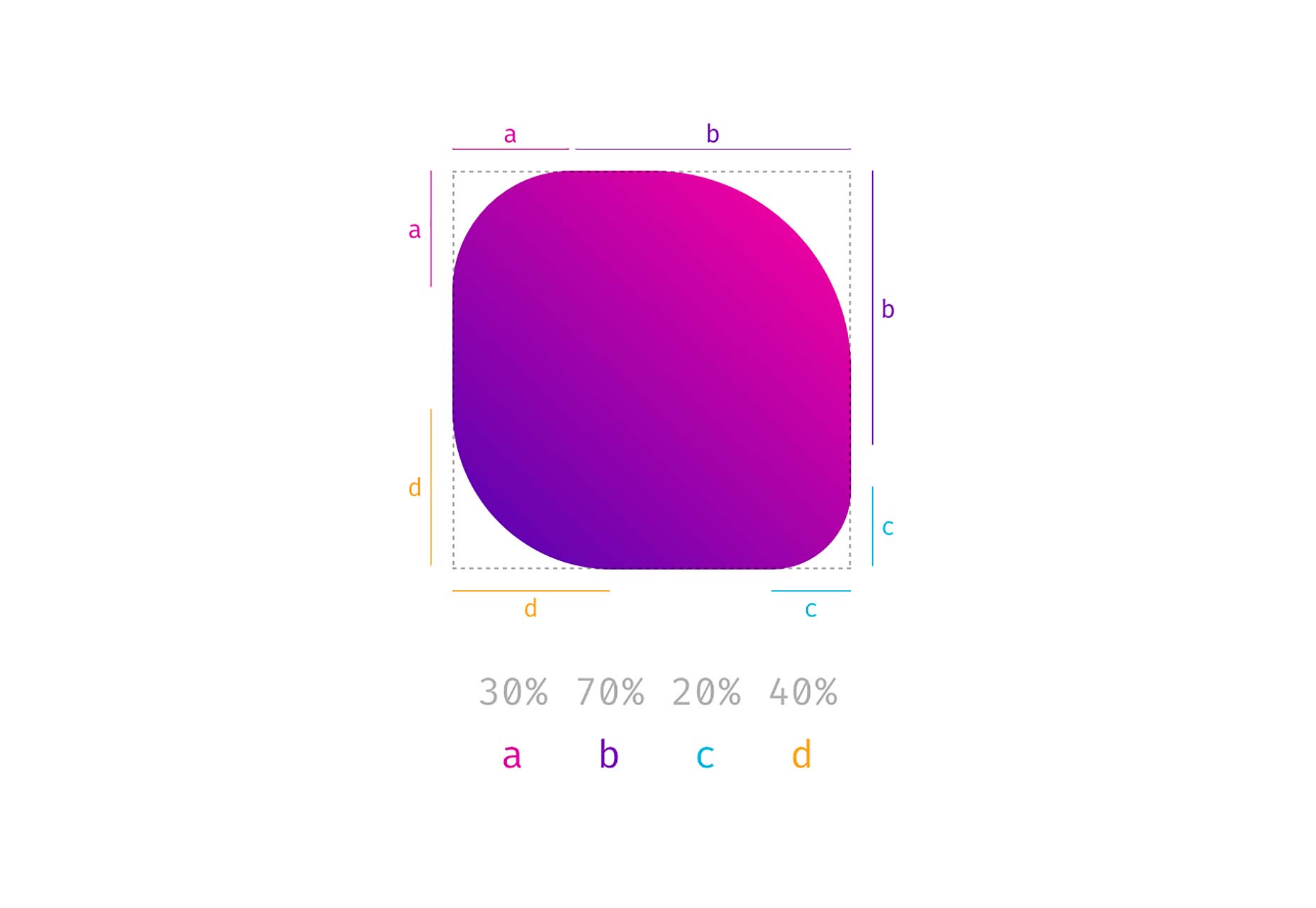
個別指定四個不同的角度
border-radius: 30% 70% 20% 40%;以順時針方式 依續由 左上 右上 右下 左下 設定各四個值
如下圖所示
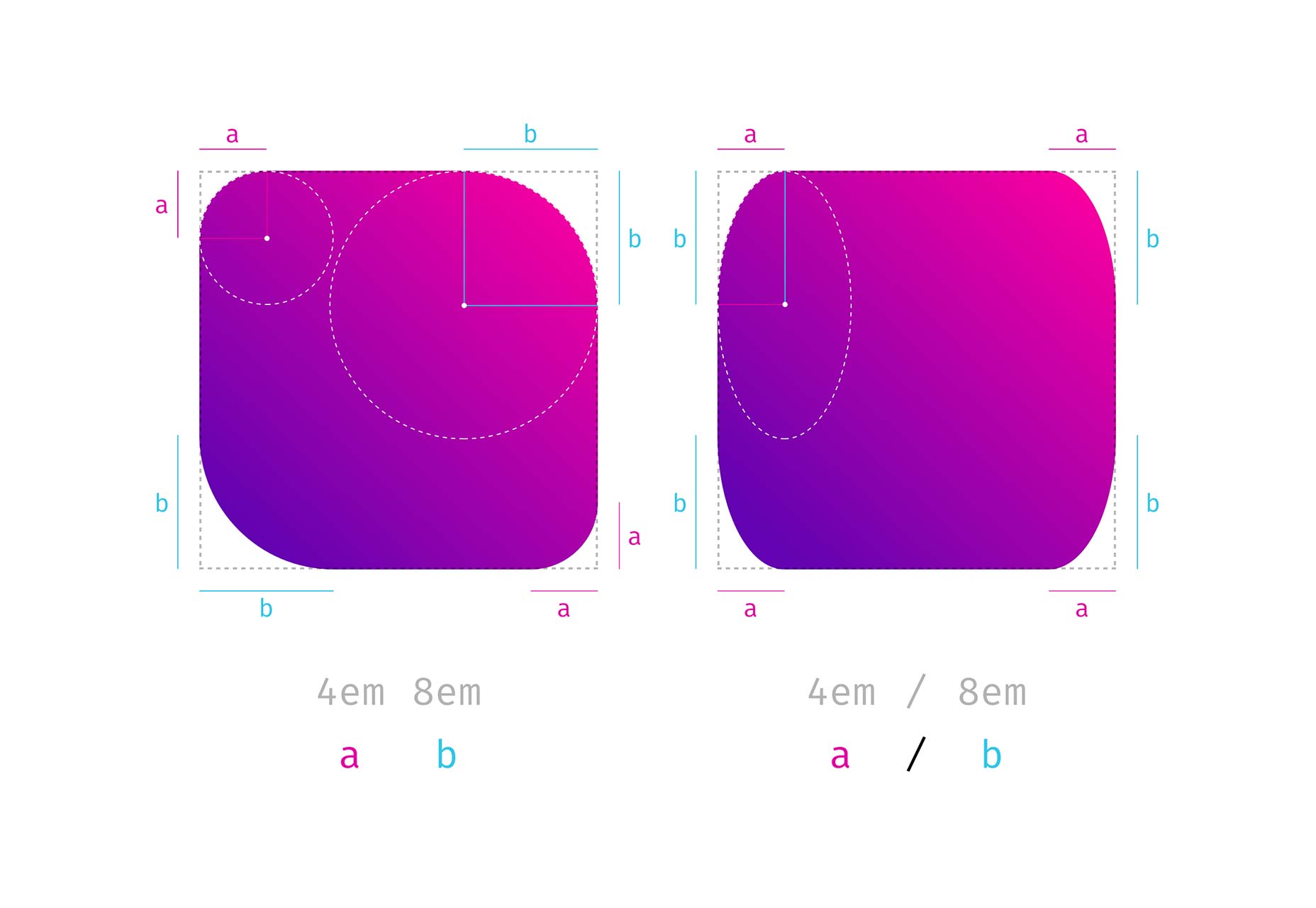
有斜線與沒斜線的差異
border-radius: 4em 8em;沒斜線 4em 表示為 左上與右下 8em 表示為 右上與左下
border-radius: 4em/8em;CSS 值裡有斜線 斜線前表示 x 軸 斜線前表示 y 軸
如下圖所示
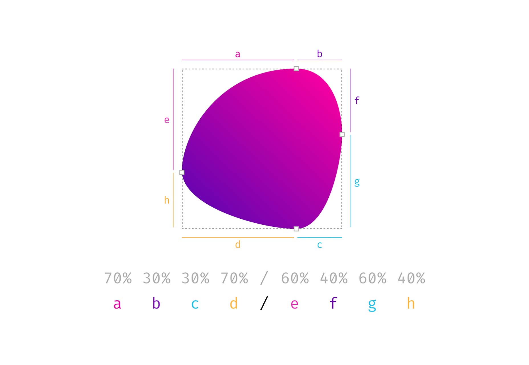
不規則圓角圖形
border-radius: 70% 30% 30% 70% / 60% 40% 60% 40%;這個圓看起來有點奇怪 但請記得 border-radius: 50%; 會得到一個圓 因為定義的一邊值 加起來會等於 100%; 且沒有剩下的直線
如下圖依續對照 不同的值會各自產生不同的弧形
最後感謝這篇文章的教學,才得以讓我理解,本文也是參照這篇文章所撰寫而成 https://www.webdesignerdepot.com/2018/10/css-border-radius-can-do-that/